Wednesday, October 29, 2008

Larry Hughes Injured? Nooooo.


That's a condescending "Nooooo" by the way.

From the Chicago Sun-Times:
October 24, 2008
BY BRIAN HANLEY bhanley@suntimes.com

Larry Hughes was optimistic Thursday he will be back well before the six-to-eight-week time frame he initially was given after dislocating his right shoulder in the Bulls' 85-75 victory Wednesday night at Minnesota.

''I'm pretty positive it won't take me that long to get back on the court,'' said Hughes, who was wearing a sling. ''It's kind of a weird thing the MRI looks as good as it does. It's really weird that it's not bothering me as much as it should or nothing's really showing up.''

Hughes said he will undergo a second MRI exam today in which dye is injected into the joint in hopes of getting a more clear picture of any damage.

''I'll know a little bit more [today], but I'm feeling pretty good right now,'' he said. ''The test [today] will show a little bit more in-depth of what's really going on.''

Hughes was injured when he and the Timberwolves' Mike Miller dived for a loose ball late in the third quarter.

''It was kind of a freak play because it wasn't really a high-impact collision or anything like that,'' Hughes said. ''It was more my body was going one way and my arm was pulled down the other way. It kind of slid rather than popped. That was a good thing because when it was put back in place, it kind of slid back in place.

''I've done everything that everybody's asked me to do as far as the MRIs and X-rays, taking the physical exam and all that. Right now it's just kind of sore, just feels like I need a couple days rest.''


This guy is made of glass. At least when it's not time to get paid.

On a more personal note, school sucks and there isn't much else going on with me. Plus I turn 20 soon. Ugh. Lots of regrets, small ones too. A lot of small ones.
Tuesday, October 21, 2008

ESPN's Page 2 Delivers


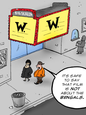
They usually post some clever little comic on the home page of Page 2, but this one has to be the best I've seen in a while. I'm pissed I didn't think of it first. You can definitely say the same thing can be said about the Lions.

Or my flag football team, but that's a whole 'nother story.

Thursday, October 16, 2008

The Diving Bell and The Procrastinating College Student


I'm supposed to be writing a shot-analysis which is worth 20% of my grade in film, a class I need to help my GPA. Certainly my best grades aren't coming from Linear Algebra or Design and Analysis of Algorithms. I haven't typed a word yet. The paper is due at 10am. I also have an online quiz to do by 9am. Will I sleep? Stay tuned.

The film that is the subject of my paper is this incredible French film known in the US as "The Diving Bell and The Butterfly". It's an amazing true story, and instead of getting into it, I'll just advise you to see this movie one day. It's artsy, but it'll have an impact.

Tuesday, October 14, 2008

Mid-Term Season

NOOOOOOOOOOOOOOOOOO!

But on a positive note, that means it's Midnight Madness time. And that definitely gets a thumbs up from me.

I have nothing to talk about, I just want to blog more than 3 times a month.

Hey look, the NBA scoreboard works.


Greatest Call Ever (That doesn't involve Kevin Harlen, of course). Harlan is an amazing announcer, just amazing.

Friday, October 3, 2008

NBA: Grading The New Uniforms

First off, MILLEN GOT FIRED. WOOO! WOOO! WOOO! But they are still the Lions.

Now Media Day 2008 recently passed in the NBA, which brought along some interesting photos and new uniforms. A few teams decided to go back to their 90's roots with stripes, others wanted to modernize their uniforms, while a team like Oklahoma City tries to discover an identity. They failed. Let's jump right into the grading of the league's newest uniforms.

Taking It Back


Both the Magic and the Hornets decided to go back to the 90's with the stripes look. Personally I love it. My favorite jerseys include the Magic back with Penny and Shaq, and the Bulls Black Away jerseys. It's a good look. But for some reason, it just looks a lot more natural on the Hornets jerseys. Plus Orlando's jerseys kind of curbs outwards towards the top rather than being straight. I also want to thank Dwight for the pseudo-inappropriate pose right there. He probably took more time practicing that than his FT's.

Orlando's Grade: B


This doesn't have anything to do with their uniforms, but I really like the Hornets as a team. I'll admit I never was high on David West, but Chris Paul has that man looking beastly. The stripes on the jersey are very well executed and bring back memories of the Charlotte days. They are by far my winner of the meaningless Media Day Jersey Battle.

Hornets' Grade: A+

The Upgrades


Two teams decided to update their uniforms this year. The Kings went with a very subtle change to the side of the jerseys, darkened the lettering, and changed their home jerseys to say "Sacramento" instead of "Kings". It's small, but the jerseys look slightly better. Many people won't get a chance to see them because Sacramento frankly isn't that good anymore. Kevin Martin is one of the better SGs in the league, and Francisco Garcia should have a break-out season with Artest gone, but this team won't be in the playoffs for another 2-3 years.

Kings' Grade: B-


Minnesota made a more drastic change to their uniforms getting rid of the black trim with the green trees and going with a more modern look. The best part about their old uniforms was the font, which they intelligently kept. These new jerseys remind me somewhat of those green Dallas alternate road jerseys, except they look better. I'm liking the large blue sky and tree trim. A big negative for these jerseys is the logo on the back of the shorts. Why do we need an a$$ logo? That's the dumbest thing I see with sports uniforms. Don't draw attention to that area, just let it be. Have we not learned from the Idaho situation (Google it)?

Timberwolves' Grade: B+ (Penalized for butt logo)

The New Kids on The Block

Why the hell did the New Kids on the Block come back? Were they needed?


That's besides the point. I referring of course to the Oklahoma City Thunder. So I guess Kevin Durant is a Thunder now? A Thunder. I got used to the Magic and the Heat, so I guess Thunder isn't so bad. I just wish they went with something that was plural. I'm just calling them OKC from now on.

I'm really starting to lose focus. It's probably because OKC's uniforms are very forgettable. The logo is weak too. I was really hoping they went with some of the Black & Gold designs that some fans created, not this half Bobcats half Knicks colorway they have going on. They look like those jerseys for the created teams on NBA 2K. I'm pretty sure there is a Thunder logo on there as well. These jerseys lack identity, appeal, or style. I'm interested to see how the away jerseys look, they can't get any worse.

Thunder's OKC's Grade: D

And Just to Laugh